검색결과 리스트
관심에 해당되는 글 121건
- 2014.09.24 macintosh Plus
- 2014.09.14 의자가 되는 법
- 2014.08.11 넥센과 삼성에 대한 단상
- 2014.08.04 Sheffer touchdown Thin Model
- 2014.08.03 sheffer touchdown TM 만년필..
- 2013.12.28 bulletproof
- 2011.09.17 Banksy's Exit Through The Gift Shop (선물 가게를 지나야 출구)
- 2011.06.23 그렇고 그런 사이..^^
- 2011.06.22 사랑이라는 이유로
- 2011.06.21 물 속의 칼
글

macintosh plus
초기의 fat mac(512k mac)의 한계를 뛰어넘어 scsi와 여러 확장성을 무기로 무려 4년 9개월 간 단일 모델로 생산된 최장 모델 맥..
하드디스크가 없고 팬도 없다..
아날로그 보드에 문제가 있어 모니터가 왔다 갔다 했는데..
전원 주변의 크랙된 냉납 두 군데를 녹여서 다시 납땜했더니 멀쩡하게 살아났다.
키보드는 512K 용 기계식 키보드.. 커서키와 ctrl키가 없다. 전화선과 같은 규격의 잭.. 하지만 연결 접점은 다르다.
마우스는 원버튼 마우스.. 애플 II와 같은 DE-9 방식이라 한다.
외장 하드는 비싼 돈 주고 산 20메가.. 시스템 6.0.5와 writing tutorial III이라는 영어 쓰기 프로그램이 들어 있다.
문제는 파일 교환을 못하겠다..
설정
트랙백
댓글
글

영화는 결국 감독을 닮는지.. 감독처럼 친절하지 않고 두서 없지만.. 솔직하고 할 말은 다하고 다정다감하다. 결국 사적 다큐라.. 자신의 문제에 고민하고 어느 정도는 해답을 찾아낸 것 같다.. 가끔 두서 없고 어수선한 이미지의 사용이 거슬릴 때도 있지만 편집할 때 그 이미지 하나 하나 감정 이입 해가며 힘들어 하며 버리지 못하는 모습이 눈에 선해서.. 이해하는 것으로..
그리고 여담이지만 촬영 감독님 때문인지 전반적으로 프레임이 너무 편해졌다..^^
특히 첫 작업실 촬영 같은 경우는 확 느껴지는 고급스런 프레임에 감동..^^
영화의 내용은 내가 봐왔던 감독의 작업 중에 자신의 이야기를 가장 심도 깊고 무겁게.. 고민한 흔적이 너무 많아서.. 공감하고.. 또 하고 싶은 얘기들이 많아질 수 밖에 없었다. 의자는 어찌보면 가장 그 목적성이 분명한 오브제이다. 용도와 그 앉는 사람에 대한 정보까지 모두 가지고 있는 오브제이다. 하지만 그는 영어 제목에서 How to make a chair가 아니라 become이란 단어를 쓴다. 만들어지는 것이 아니라 되는 것.. 그는 의자에 대해 이렇게 말하고 있다.
여기서부터 영화가 말하고자 하는 그 내용이 얼마나 감독에게 절실하게 하고 싶은 말이었는지.. 얼마나 깊이 고민하고 아파하던 문제였는지를 알 수 있었다. 그리고 그 모든 문제의 종착지인 엔딩 장면을 보며 나는 왈칵 쏟아져 나오는 무언가를 느낄 수 밖에 없었다.. 모든 장면은 엔딩 장면에 와서야 연결이 되었고.. 충격적으로 다가왔다.
엔딩 장면을 보면서 인트로와 수없이 반복되던 장면이 실은 그 자신의 현재 상태였음을.. 객관적으로는 짧은 순간이지만 그 자신에게는 정지한 시간처럼 느껴지는 그 찰나의 순간이었음을 생각하자.. 코끝이 찡해왔다...
그 시간은 나 역시 고민했었던 문제였고.. 나역시 작업으로 담을 수 밖에 없었던 문제였다.. 나는 그 순간의 나의 세계를 기록하는 방식으로 작업했지만 그는 자신의 삶을 대하는 태도를 통해 그 자신의 해결책을 제시했다.. 결국 삶의 태도는 사람마다 다르기에.. 그는 철저히 사적인 해답을 제시하면서 그 해답을 깊이 생각하도록 만들었다..
인상 깊은 장면은 너무 많지만.. 이제 더쓰면 스포이므로..
그리 재미 없을 지도 모르고.. 그리 친절한 다큐는 아니지만.. 치열한 삶을 원하는 사람들.. 혹은 목적 지향적 사람들.. 꿈이 깨진 자들.. 뭐 이런 분들은 "의자가 되는 법"이라는 다큐를 보는 것을 권한다.
엔딩 장면을 보며 충격에 빠져 울컥하던 나의 심정을 이해할 수 있을 것이다.
물론 올해 이 영화를 본다는 것은 상당한 정보와 잉여력을 요구하는 일이겠지만..
팁을 주자면 이번 DMZ 다큐멘터리 영화제에 상영한다고 한다.
DMZ 다큐멘터리 영화제
1회) 9/19(금) 20:00 / 메가박스 킨텍스 5관 * 관객과의 대화
2회) 9/22(월) 13:00 / 메가박스 킨텍스 4관
설정
트랙백
댓글
글
재밌는 일이다. 독주로 재미없어지는 2014년 프로야구.. 그 중심엔 삼성과 넥센이 있다.
하지만 넥센으로써는 억울한 일이다. 박병호 강정호 서건창 김민성 모두 다 터진 역대급 시즌이지만 여전히 1위는 삼성이며 점점 더 멀어져 간다.
이유는 단연 투수력의 열세라고 말할 수 있을 것이다. 실점이 많아도 득점으로 만회하는 특징이 있는 넥센은 투수력만 받쳐주면 무적의 팀이 될 것이라고 생각하는 사람들이 많다. 하지만 넥센은 아직 부족한 면이 좀 있는 것 같다.
우선 선발 투수의 다양화.. 일단 선발 자원이 없는 상황에서 다양화는 더 먼 길이다. 하지만 삼성의 선발진을 보고 배워야 할 부분은 분명히 있다. 용병 선발은 솔직히 말해 넥센이 더 강하다. 그리고 배영수 장원삼 윤성환의 삼성 토종 투수는 리그를 씹어먹는 투수들이 없다. 오재영 문성현 강윤구 금민철 하영민도 한두 경기는 그들보다 나을 때도 있다. 삼성의 선발진은 자원 이상의 무언가가 있다. 그것은 다양한 스타일의 선발이다. 파이어 볼러, 제구력, 바깥쪽 슬라이더가 주무기인 선수에 안쪽 승부가 주무기인 선수가 있다. 그들의 적절한 배합은 상대팀으로 하여금 머리는 적응하지만 몸은 적응하지 못하게 만들고 있다. 생각해 보라. 파이어 볼러가 나온 다음날 느리고 제구력이 되는 투수가 나와서 머리를 휘저어 놓는다. 하루는 바깥쪽 슬라이더가 날카로와 컨택하려고 온갖 신경을 바깥쪽에 쓰고 나면 다음날 몸쪽 묵직한 직구들이 날아온다. 세 경기 중 한경기는 버리고 타이밍을 맞출 수 밖에 없다. 삼성이 스윕을 거의 당하지 않는 이유이다. 이에 비해 넥센은 특색이 그다지 없다는 생각이다. 질과 양에서 모두 부족한 모습이다.
계투는... 상황에 따라 낼 수 있는 양 자체가 차이가 난다. 한현희로 버티기엔 좀.. 특히 좌타 상대의 스페셜리스트가 없다. 삼성의 계투진이 많이 약해졌지만 모두 자신이 투입된 상황에서 원포인트를 확실히 잡을 수는 있다. 왼손 오른손 언더핸드 오버핸드 속구 변화구 모두 상황에 맞게 나올 수 있는 계투진이 있다. 뭐.. 이 부분은 결정적.. 마무리는.. 음.. 뭐.. 삼성도 한가지는 있어야 하니까..ㅋ 그래도 임창용이 없었으면 이러한 계투의 다양화를 가져올 수 없었을 것이다. 그리고 삼성의 계투진은 세대교체 중이다.
그리고 가장 큰 한가지는 내야 수비의 쉬프트.. 삼성은 류중일 감독의 지도 하에 완벽한 내야를 구축했다. 작전이 나올 수 있는 어떠한 상황이라도 투수와 타자, 그리고 내야진들의 상태를 고려한 완성도 높은 쉬프트들이 나온다. 그리고 성공하는 예가 꽤 많다. 하지만 넥센은 내야수만 보면 리그 대표선수들로 구성되어 있으나 쉬프트의 완성도는 삼성에 비해 세밀함이 떨어진다. 그리고 강정호의 수비범위가 미세하게 좁아지고 있는 것도 문제다. 하지만 삼성보다 큰 문제는 아닐 것이라 본다. 이유는 미안하지만 선발진의 땅볼유도율이 그리 좋지 못하다. 김상수와 강정호를 예로 들자면 한 경기에서 그 앞으로 날아오는 공의 갯수가 다르다. 또한 쉬프트가 나오는 숫자도 다르다. 실책 수만 보지 말고 실책율을 비교한다면.. 솔직히 단연 삼성 내야진의 강점이 나오지 않을까..
그리고 외야 수비는 넥센이 우세하다 생각하지만 그것도 조금은 모를 일이다. 이유는 이택근 역시 수비 범위가 좁아지고 있기 때문이다. 삼성은 박해민이라는 걸출한 중견수가 나와서 박한이와 최형우의 수비마저 덩달아 좋아진 느낌이다.
타선을 얘기하자면 외국인 타자 로티노의 존재감이 없어도 펀치력은 정상급.. 서건창-이택근-유한준-박병호-강정호-김민성-이성열-문우람-박동원에 윤석민, 허도환 등등 쟁쟁한 파워가 있고 타선의 연결은 정석적인 편.. 그리고 모두 자기 스윙을 하는 스타일이다. 그래서 솔직히 갑자기 생기는 기회나 기회를 만드는 작전은 조금 약한 듯. 타자들의 클러치 능력도 조금은 떨어지는 편이다. 반면 삼성은 김상수-나바로-박한이-채태인-최형우-박석민-이승엽의 9-6번 타자들이 1-4번 역할을 모두 해낼 수 있을 만큼 작전 수행 능력이 좋고 클러치 능력이 뛰어나다. 또한 김상수와 박해민의 도루나 내야 작전 수행 능력도 높은 편.. 이지영은 현재 잘치고 있으나 기복이 있다고 봐야할 듯.. 삼성은 펀치력 보다는 유기적인 연결이 강하다. 김상수, 나바로는 리드 오프가 될 수 있고 김상수-나바로-박한이는 2번 타자의 역할을 할 수 있으며 나바로-박한이-채태인은 3번, 채태인-최형우-박석민은 4번, 채태인-최형우-박석민-이승엽은 5번 역할을 충분히 할 수 있는 타자다. 즉 어디서 걸려도 1번부터 시작되는 상위타선 같은 분위기를 겪어야 한다. 9번, 2번, 6번이 장타도 갖추었다는 것이 삼성의 강점.. 또한 도루 상위권의 김상수, 박해민은 상대 내야를 충분히 흔들 수 있다. 삼성이 2사 이후에도 다득점을 낼 수 있는 것은 이러한 유연한 타선의 흐름이 있기 때문이다. 또한 선수가 빠져 있을 때에도 멀티가 가능하므로 티가 나지 않는다는 장점도 있다. 심지어 4번 타자가 한달을 빠져 있어도 티가 안 날 정도이다.
단기전은 모르겠으나 솔직히 장기전에서는 아직 삼성에 견줄 팀 자체가 없는 것 같다. 하지만 야구는 모른다. 아주 자그마한 틈을 파고들 수 있는 팀이 있다면 삼성을 무너뜨릴 수 있으려나.. 왠만한 힘대힘이나 시스템으로 삼성을 제압하기엔 어려워 보인다. 넥센이라고 할 지라도...
설정
트랙백
댓글
글
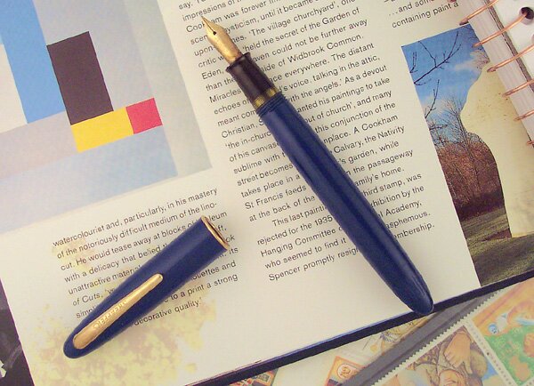
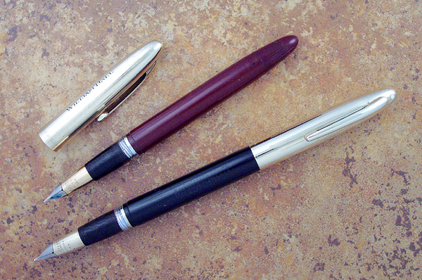
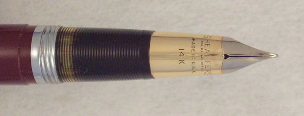
드디어 시필.. 잉크는 파카 큉크 블루블랙...
일단 세필에 트라이엄프 닙의 사각거림까지..
맘에 든다. 아껴줘야겠다..


설정
트랙백
댓글
글
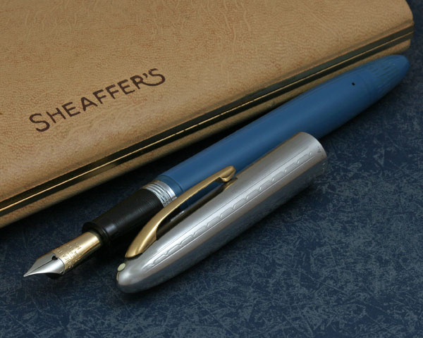
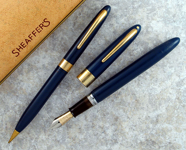
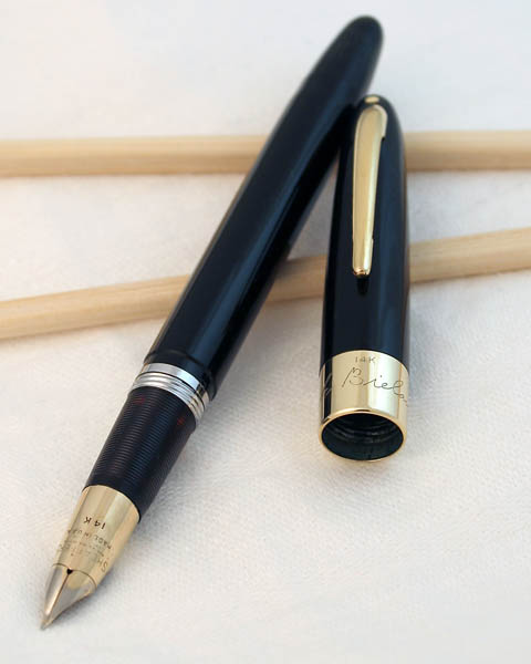
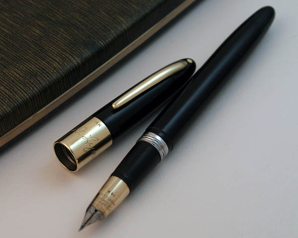
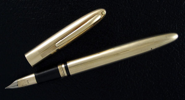
스노클을 구하려다 저 TM의 자태에 빠져 구했다.. 이제 잘 써야지..
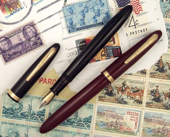
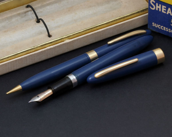
Sheaffer Thin Model Touchdown Pens 1950-1952
by Jim Mamoulides, July 8, 2002
The Touchdown Pen is Slimmed Down
In late 1950 Sheaffer introduced the Thin Model or "TM" pen line, essentially a redesign of its year-old Touchdown pen line to a slimmer profile. It is possible that this was a first move before the introduction of the Snorkel pen line in late 1952, which is essentially the same pen modified to accept the Snorkel filling mechanism, itself an evolutionary modification to the Touchdown filling system. With the new, more slender pen, retooling would be easier and public acceptance of the new, more slender pen would be easier.
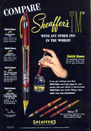
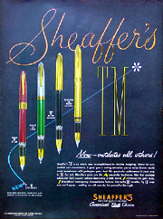
1952 Sheaffer TM Touchdown Advertisement Showing Touchdown Features
Sheaffer, always a leader in advertising, had heavily advertised the Touchdown pen line as both advanced and easy to use and fill. The pen was promoted as more comfortable and convenient to use than "yesteryear pens," clearly an attempt to show the line as both innovative from a design and a technical point of view. Being "pencil slim" was promoted as an ergonomic benefit. Advertisements carried tag lines such as "Far Into The Future..." and "Now - Outdates All Others..." as if to say all other pens are old fashioned. Of note is that advertisements almost always show the TM followed by an asterisk, which further down in the copy will say "* Thin Model". Perhaps Sheaffer did not want the pens to be simply known as "TM"s, but wanted the words "Thin Model" to stick in the mind.
Features were given heavy emphasis: the "one stroke Touchdown filler that provides substantial fluid capacity without demanding a thick barrel," the unique Triumph nib, the spring tensioned cap clip, and the visulated "Visible Refill Indicator" section.
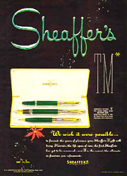
1951 Sheaffer's TM Advertisement Featuring the Sentinel Model
Sheaffer continued the use of many of the established and recognized model names created in the late 1930s and 1940s, applying them to the new TM Touchdown line.
Sheaffer began the use of injection molded plastics in 1948, a process that required the production of single color pens, which dates models of 1948 and 1949 prior to the introduction of the TM line. Sheaffer continued this process with the new TM pens, making solid color, generally dark tone plastics, offered in black, green, burgundy, blue and brown. Sheaffer's name for these colors was Black, Burgundy, Evergreen Green, Persian Blue, and Burnt Umber Brown, though the full names did not always show up in advertisements.
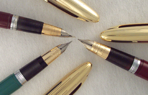
Sheaffer Two Tone Triumph Nibs Clockwise from Right - Touchdown / Snorkel / TM Touchdown
Most Thin Model Touchdown pens are essentially trim variations of each other. All of the Triumph nib pens, for example, are the same pen with different cap and barrel combinations. This undoubtedly made production of the line simpler. All TM models have the spiral grip, which makes the pen easier to hold, and with less pressure. Sheaffer offered sixteen different Triumph nib point sizes, including flexibles, accountant, shorthand, stubs, obliques and music. Triumph nib pens will run stiffer than similar marked open conventional nibs.
Matching Ballpoints And Pencils
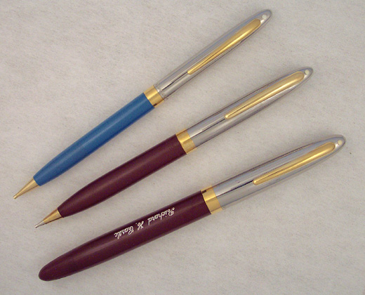
Sheaffer Sentinel TM Touchdown Burgundy Pen and Pencil Set with Thinner Snorkel Pencil
All TM Touchdown line pens had matching pencils and ballpoints with the same trim. The pencil was unchanged from the twist-action Fineline propel-repel-expel pencil that complimented the larger Touchdown line introduced in 1949. Sheaffer promoted the design of their pencils, including the "sleeve-type" tip, which was designed to avoid the sharp edges that cause leads to snap off during hard writing, and the spiral non-slip grip.
The Stratowriter ballpoint pen also carried over from the earlier Touchdown line. It was a large, screw cap pen that matched the look of the fountain pen. Stratowriters have the same innerspring clip and spiral non-slip grip features. Sheaffer advertisements claimed the Stratowriter's "Micro-Crafted" refills could hold 300% as much ink as average cartridges and would not skip, an important feature as the early ballpoints from the late 1940s were notorious skippers. In 1951, Sheaffer replaced the Stratowriter with a more slender and less expensive slip-cap ballpoint, which was carried into the Snorkel line.
The TM line was sold singly and in sets of up to three writing instruments. Low-end models were packaged in paperboard boxes. Higher line pens and ensemble sets were packaged in attractive tan leatherette clamshell boxes. The complete model list is as follows, in general order of original price:
Non-White Dot Models
Sheaffer Touchdown Craftsman Persian Blue 1950-1952
Craftsman - The Craftsman was the "low-priced leader" entry level Touchdown model, an update of the Craftsman lever-fill pen.
Identification guide and features:
Conventional 14 karat gold nib, stamped "SHEAFFER'S" over "33" and hallmarked
Nib is Sheaffer nib code 33 and marked as such
Nib grades included extra fine, fine, medium, broad, and shorthand
Visulated section
Gold filled fixed clip stamped "SHEAFFER'S"
1/32 inch wide gold filled cap band
Plastic cap and barrel in solid colors
About 5 1/8 inches long capped and 6 inches posted
Available colors were Black, Burgundy, Evergreen Green, Persian Blue, and Burnt Umber Brown
Retail price for the pen was US $3.75, matching Stratowriter ballpoint US $3.25 (1950), and matching pencil US $3.00
Sheaffer Touchdown Admiral Black and Burgundy 1950-1952
Admiral - The Admiral is the trimmed up economy Touchdown, a Craftsman with more brightwork and a fancier nib.
Identification guide and features:
Conventional 14 karat gold Feathertouch two-tone platinum masked nib, stamped "SHEAFFER'S" over "Feathertouch" over "5" and hallmarked
Nib is Sheaffer nib code 5 and marked as such
Nib grades included extra fine, fine, medium, broad, and shorthand
Visulated section
Gold filled fixed clip stamped "SHEAFFER'S"
1/8 inch wide gold filled cap band
Plastic cap and barrel in solid colors
About 5 1/8 inches long capped and 6 inches posted
Available colors were Black, Burgundy, Evergreen Green, Persian Blue, and Burnt Umber Brown
Retail price for the pen was US $5.00, matching Stratowriter ballpoint US $5.00 (1950), and matching pencil US $3.75
Sheaffer Sovereign TM Touchdown Persian Blue pen and pencil set c1950 early version
Sovereign TM (Early) - The Sovereign TM is essentially the same pen as the Statesman, but without the White Dot and fitted with a Feathertouch type nib. The two pens could easily be confused with a cap swap, and sometimes the pen may be found with the other model pencil.
Identification guide and features:
Conventional 14 karat gold two-tone platinum masked nib, stamped "SHEAFFER'S" over "Feathertouch" and hallmarked - Nib is Sheaffer nib code 73
Some models will have conventional 14 karat gold two-tone platinum masked nib, stamped "SHEAFFER'S" over patent information stamping and hallmarked - Nib is Sheaffer nib code 74
Nib grades included extra fine, fine, medium, broad, and shorthand
Visulated section
Gold filled innerspring clip
1/4 inch wide gold filled cap band
Plastic cap and barrel in solid colors
About 5 1/4 inches long capped and 6 1/8 inches posted
Available colors were Black, Burgundy, Evergreen Green, Persian Blue, and Burnt Umber Brown
Retail price for the pen was US $8.75, matching slip-cap ballpoint US $6.00 (Late 1951), and matching pencil US $5.00
Sheaffer Sovereign TM Touchdown Pastel Blue c1951 late version
Sovereign TM (Late) - The metal cap Sovereign TM is similar to the Statesman, but with a stainless steel cap with a White Dot and fitted with a Feathertouch type nib. This version of the Sovereign was probably manufactured only in 1951, right before the Snorkel was released.
Identification guide and features:
Conventional 14 karat gold two-tone platinum masked nib, stamped "SHEAFFER'S" over patent information stamping and hallmarked - Nib is Sheaffer nib code 74
Nib grades probably included extra fine, fine, medium, broad, and shorthand
Visulated section
Gold filled innerspring clip
Polished stainless steel cap with five engraved panels - a set of two straight lines with a dashed and diamond line between
Barrel in solid colors
About 5 1/4 inches long capped and 6 1/8 inches posted
Available colors were probably Black, Burgundy, Pastel Green, Pastel Blue, and Pastel Grey
Retail price for the pen was probably US $8.75, matching slip-cap ballpoint US $6.00 (Late 1951), and matching pencil US $5.00
White Dot Models
Sheaffer Statesman TM Touchdown Pen And Sovereign TM Pencil Persian Blue 1950-1952
Statesman TM- The Statesman is the entry level White Dot model and the only one with a conventional open nib. Unlike the very similar Sovereign, the Statesman's nib face imprint design reflects the new TM Triumph nib stamping, rather than the older Feathertouch style. Sheaffer gave this new design the "74" point type, but unlike earlier nibs, the point type number does not appear on the nib.
Identification guide and features:
Conventional 14 karat gold two-tone platinum masked nib, stamped "SHEAFFER'S" over patent information stamping and hallmarked - Nib is Sheaffer nib code 74
Nib grades included extra fine, fine, medium, broad, and shorthand
Visulated section
Gold filled innerspring clip
3/8 inch wide gold filled cap band with two engraved trim lines
Plastic cap and barrel in solid colors
About 5 1/4 inches long capped and 6 1/8 inches posted
Available colors were Black, Burgundy, Evergreen Green, Persian Blue, and Burnt Umber Brown
Retail price for the pen was US $10.00, matching Stratowriter ballpoint US $10.00 (1950), matching slip-cap ballpoint US $6.00 (Late 1951), and matching pencil US $5.00
Sheaffer Valiant TM Touchdown Burgundy 1950-1952 - With Touchdown Plunger Extended
Valiant TM - The Valiant is the entry level Triumph nib White Dot model and is otherwise identical to the Statesman. The nib is the reason for the 25% price premium.
Identification guide and features:
Triumph 14 karat gold two-tone platinum masked sheath nib, stamped "SHEAFFER'S" and hallmarked - Nib is Sheaffer nib code 12
Sixteen nib grades including extra fine, fine, medium, coarse (broad), stub, broad stub, left oblique stub, accountant, shorthand, flexible extra fine, flexible fine, flexible medium, flexible coarse (broad), flexible stub, flexible left oblique stub, and music
Broad stub, left oblique stub, flexible left oblique stub, and music nibs were extra cost options
Gold filled innerspring clip
Visulated section
3/8 inch wide gold filled cap band with two engraved trim lines
Plastic cap and barrel in solid colors
About 5 1/4 inches long capped and 6 1/8 inches posted
Available colors were Black, Burgundy, Evergreen Green, Persian Blue, and Burnt Umber Brown
Retail price for the pen was US $12.50, matching Stratowriter ballpoint US $10.00 (1950), matching slip-cap ballpoint (Late 1951) US $6.00, and matching pencil US $5.00
Sheaffer Sentinel Deluxe TM Touchdown Burgundy Pen and Pencil Set 1950-1952
Sentinel Deluxe TM - The Sentinel Deluxe may also be seen in advertisements and box labels as the Sentinel De Luxe, a hold over from earlier models. Although the cap looks like chrome plating, it's actually polished stainless steel, a much more durable finish.
Identification guide and features:
Triumph 14 karat gold two-tone platinum masked sheath nib, stamped "SHEAFFER'S" and hallmarked - Nib is Sheaffer nib code 12
Sixteen nib grades including extra fine, fine, medium, coarse (broad), stub, broad stub, left oblique stub, accountant, shorthand, flexible extra fine, flexible fine, flexible medium, flexible coarse (broad), flexible stub, flexible left oblique stub, and music
Broad stub, left oblique stub, flexible left oblique stub, and music nibs were extra cost options
Visulated section
Gold filled innerspring clip
3/16 inch wide gold filled cap band
Polished stainless steel cap chased with a repeating pattern of four straight longitudinal engraved lines in a stepped grouping
Plastic barrel in solid colors
About 5 1/4 inches long capped and 6 1/8 inches posted
Available colors were Black, Burgundy, Evergreen Green, Persian Blue, and Burnt Umber Brown
Retail price for the pen was US $15.00, matching Stratowriter ballpoint US $10.00 (1950), matching slip-cap ballpoint (Late 1951) US $7.50, and matching pencil US $5.00
Sheaffer Crest Deluxe TM Touchdown In Burgundy and Black 1950-1952
Crest Deluxe TM - As with the Sentinel Deluxe, the Crest Deluxe is sometimes seen in advertisements and box labels as the Crest De Luxe, also a hold over from earlier model names. From the late 1930s until the end of the Snorkel line in 1959, Sheaffer associated the Crest model name with its gold filled metal cap pens.
Identification guide and features:
Triumph 14 karat gold two-tone platinum masked sheath nib, stamped "SHEAFFER'S" and hallmarked - Nib is Sheaffer nib code 12
Sixteen nib grades including extra fine, fine, medium, coarse (broad), stub, broad stub, left oblique stub, accountant, shorthand, flexible extra fine, flexible fine, flexible medium, flexible coarse (broad), flexible stub, flexible left oblique stub, and music
Broad stub, left oblique stub, flexible left oblique stub, and music nibs were extra cost options
Visulated section
Gold filled innerspring clip
1/10 14 karat gold filled cap chased with a repeating pattern of four straight longitudinal engraved lines in a stepped grouping
Plastic barrel in solid colors
About 5 1/4 inches long capped and 6 1/8 inches posted
Available colors were Black, Burgundy, Evergreen Green, Persian Blue, and Burnt Umber Brown
Retail price for the pen was US $21.00, matching Stratowriter ballpoint (1950) US $12.50, matching slip-cap ballpoint (Late 1951) US $9.00, and matching pencil US $9.00
14 Karat Gold Cap Band White Dot Models
Both the Signature and Autograph models were advertised as available with the owner's personal signature engraved on the 14 karat gold cap band.
Sheaffer Signature TM Touchdown Black
Signature TM - The Signature TM is a 14 karat gold cap band model introduced with the TM line. The thinner cap band fits with the more slender lines of the TM pens, and gave Sheaffer a new price point below the Autograph model.
Identification guide and features:
Triumph 14 karat gold two-tone platinum masked sheath nib, stamped "SHEAFFER'S" and hallmarked - Nib is Sheaffer nib code 12
Sixteen nib grades including extra fine, fine, medium, coarse (broad), stub, broad stub, left oblique stub, accountant, shorthand, flexible extra fine, flexible fine, flexible medium, flexible coarse (broad), flexible stub, flexible left oblique stub, and music
Broad stub, left oblique stub, flexible left oblique stub, and music nibs were extra cost options
Visulated section
Gold filled innerspring clip
3/8 inch wide 14 karat gold cap band hallmarked on top front
Plastic cap and barrel in solid colors
About 5 1/4 inches long capped and 6 1/8 inches posted
Available colors were Black, Burgundy, Evergreen Green
Retail price for the pen was US $19.75, matching Stratowriter ballpoint US $12.50 (1950), matching slip-cap ballpoint (Late 1951) US $10.00, and matching pencil US $10.00
Sheaffer Autograph TM Touchdown Black
Autograph TM - The "TM for your Autograph" was the latest in a long history of offering a pen with all solid 14 karat gold appointments and with the owner's personal signature copied onto the cap band. The TM Autograph continued that tradition with the widest cap band of any of the all-plastic pens in the line. As with the previous Touchdown and Triumph lines, the Autograph was only offered in black.
Identification guide and features:
Triumph 14 karat gold two-tone platinum masked sheath nib, stamped "SHEAFFER'S" and hallmarked - Nib is Sheaffer nib code 12
Sixteen nib grades including extra fine, fine, medium, coarse (broad), stub, broad stub, left oblique stub, accountant, shorthand, flexible extra fine, flexible fine, flexible medium, flexible coarse (broad), flexible stub, flexible left oblique stub, and music
Broad stub, left oblique stub, flexible left oblique stub, and music nibs were extra cost options
Visulated section
Solid 14 karat gold innerspring clip, hallmarked at top
19/32 inch wide 14 karat gold cap band hallmarked on top front
Pencil tip is solid 14 karat gold
Plastic cap and barrel in solid color
About 5 1/4 inches long capped and 6 1/8 inches posted
Available only in Black
Retail price for the pen was US $20.00, matching Stratowriter ballpoint US $17.50 (1950), matching slip-cap ballpoint (Late 1951) US $17.50, and matching twist-action pencil US $15.00
1950 Sheaffer's TM Advertisement Showing Triumph Model
All-Metal White Dot Models
Sheaffer TM Touchdown Triumph 1950-1951
Triumph TM - The Triumph model is actually an overlay, with a black plastic base barrel. This allows the cap to fit flush with the barrel when closed. Sometimes listed in advertisements simply as the "Gold-Filled" model.
Identification guide and features:
Triumph 14 karat gold two-tone platinum masked sheath nib, stamped "SHEAFFER'S" and hallmarked - Nib is Sheaffer nib code 12
Sixteen nib grades including extra fine, fine, medium, coarse (broad), stub, broad stub, left oblique stub, accountant, shorthand, flexible extra fine, flexible fine, flexible medium, flexible coarse (broad), flexible stub, flexible left oblique stub, and music
Broad stub, left oblique stub, flexible left oblique stub, and music nibs were extra cost options
Visulated section
Gold filled innerspring clip
19/32 inch wide 14 karat gold cap band hallmarked on top front
Pencil tip is solid 14 karat gold
Gold filled cap and barrel with straight longitudinal engraved lines in a repeating pattern of four lines and a blank panel
Cap has extra wide band for engraving, barrel has blank indicia for engraving
About 5 1/4 inches long capped and 6 1/8 inches posted
Retail price for the pen was US $25.00 and matching pencil US $12.50
Crest Masterpiece TM - The Crest Masterpiece is the upscale Crest, with solid 14 karat gold cap and clip. The cap has an extra wide band for engraving.
Identification guide and features:
Triumph 14 karat gold two-tone platinum masked sheath nib, stamped "SHEAFFER'S" and hallmarked - Nib is Sheaffer nib code 12
Sixteen nib grades including extra fine, fine, medium, coarse (broad), stub, broad stub, left oblique stub, accountant, shorthand, flexible extra fine, flexible fine, flexible medium, flexible coarse (broad), flexible stub, flexible left oblique stub, and music
Broad stub, left oblique stub, flexible left oblique stub, and music nibs were extra cost options
Visulated section
Solid 14 karat gold innerspring clip, hallmarked at top
Solid 14 karat gold cap with wide cap band and chased with a repeating pattern of four straight longitudinal engraved lines, hallmarked
Plastic barrel in solid colors
About 5 1/4 inches long capped and 6 1/8 inches posted
Available colors were Black, Burgundy, Evergreen Green, Persian Blue, and Burnt Umber Brown
Retail price for the pen was US $50.00, matching Stratowriter ballpoint US $50.00, and matching pencil US $25.00
Masterpiece TM - The Masterpiece TM is the top of the line model. Like the Triumph, the Masterpiece is a solid overlay on a black plastic base barrel. Every metal part is hallmarked 14 karat gold.
Identification guide and features:
Triumph 14 karat gold two-tone platinum masked sheath nib, stamped "SHEAFFER'S" and hallmarked - Nib is Sheaffer nib code 12
Sixteen nib grades including extra fine, fine, medium, coarse (broad), stub, broad stub, left oblique stub, accountant, shorthand, flexible extra fine, flexible fine, flexible medium, flexible coarse (broad), flexible stub, flexible left oblique stub, and music
Broad stub, left oblique stub, flexible left oblique stub, and music nibs were extra cost options
Visulated section
Solid 14 karat gold innerspring clip, hallmarked at top
19/32 inch wide 14 karat gold cap band hallmarked on top front
Pencil tip is solid 14 karat gold
Solid 14 karat gold cap and barrel with straight longitudinal engraved lines in a repeating pattern of four lines and a blank panel, hallmarked
Cap has extra wide band for engraving, barrel has blank indicia for engraving
About 5 1/4 inches long capped and 6 1/8 inches posted
Retail price for the pen was US $100.00, matching Stratowriter ballpoint US $100.00, and matching pencil US $50.00
Performance
I tried a fine nibbed Sentinel and a medium nibbed Crest for this review. Both of these TM Touchdown pens are the same size, shape and proportion, about 5 1/4 inches long capped and 6 1/8 inches posted, and they are considerably light, being made of plastic and lightweight metal.
Both of the TM Touchdown pens are well balanced, whether the cap is posted or not, but I find the pen a bit small unposted. The cap is not very heavy and does not add a lot of weight.
The plating on both of the caps is very well done, and definitely not of the electroplate ilk, as with modern Sheaffer pens. Both hold a very mirrored finish that is especially 1950s on the Sentinel, reminding one of all the heavily chromed cars. Today the Sentinel would be right at home in a motorcycle shop. The caps and the section both have metal threads, giving the cap a secure, positive fit. The clip is spring loaded, making it easy to slip on, even thick fabric.
Sheaffer TM Touchdown Triumph Nib - Note Visulated Section
The colors on the TM Touchdowns are noticeably a shade darker than on the Snorkels that followed. I took some Snorkels and found a red Sentinel for comparison. The Snorkel is a bit brighter red.
All Touchdown pens are easy to fill: unscrew the cap, pull out the plunger (out of the ink!), dip the nib and section, push in the plunger once, count to ten, remove, and wipe. Only the Snorkel is easier - no wiping. The Touchdown filler is an improvement on the Vacuum-Filler it replaced. Many times Touchdown pens will appear to work out of the box, but as o-rings, seals and sacs can age out and leak, letting ink into the pen body, always consider having these pens serviced before being placed into use.
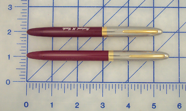
Sheaffer TM Touchdown and Snorkel Burgundy Sentinels Side by Side
The Triumph nibs on both pens are stiff, but smooth and wet writers. I will admit that I happen to like Triumph nibs, so they feel good to me. They are stiff enough to write through carbons, which was important in the late 1940s and early 1950s.
Because the TM Touchdown line was made for only two years, they aren't as plentiful as Snorkels. Don't expect this to make them worth any more, however. Many sellers will misidentify them as Snorkels and sometimes they get mixed up in Snorkel boxes. Generally, they sell for about the same, model for model. The caps will also swap with the later Snorkel pens, but they are exactly the same, so this shouldn't produce too many Frankenpens.
Don't pass over these pens because they aren't Snorkels. They work well and are good everyday users in their own right. The visulated section is a bonus not found on the Snorkel, but they are small and tend to cloud or amber. These are well made everyday pens that could easily find a place in any rotation.
설정
트랙백
댓글
글
설정
트랙백
댓글
글
|
|||||||||||

이 영화를 접하고 열렬한 뱅크시의 추종자가 된 어떤 분의 추천과.. 또 우연히 얻게 된 많은 정보들에 이끌려 상상마당에서 영화를 보았다. 그리고.. 예전에 인터넷이었는지 어느 잡지였는지 모르겠지만 그래피터들을 소개하는 글을 읽었었고 그것이 뱅크시였는지는 모르겠지만 얼굴을 숨기고 대단한 작업을 하는 그래피터가 있으며 오직 한사람만 그와 인터뷰를 해서 영화가 만들어질 것이라는 소식을 들었던 기억이 났다. 아마 외국의 케이블 채널에서 한 다큐였는지도.. 영화에 대한 일반적인 줄거리나 평론은 나보다 훨씬 잘쓰는 사람들 많으니.. 그저 내 관점에서 영화를 보며 머리에 남았던 것을 적어두고자 한다.
1. 다큐멘터리..기록과 표현의 차이..
일단 영화에 나오는 티에리는 무조건 영상이라는 매체로 기록하는 것을 반복하는 사람이었다. 그는 처음부터 다큐라는 형식으로 기록하겠다는 의지 보다는 무조건 기록하는 행위 자체가 좋았고 자신의 전부였던 사람이었다. 즉 그에게 있어서 "기록을 했다."는 그 자체가 그의 표현이었다. 하지만 그는 자신이 표현하고 있다는 사실을 전혀 인식하지 못했고 그가 기록한 사람들은 더 적극적인 형태로 표현하는 사람들이었고 그것도 아주 급진적이고 진정성 가득한 초기의 그라피터들이었다. 그가 기록을 하며 표현하는 행위를 동경하게 되는 것은 당연한 일이었다. 그는 자신의 기록, 즉 퍼포먼스의 기록 또한 적절한 형식을 찾으면 강력한 표현의 도구가 될 수 있다는 사실을 간과하고 있었던 것이다. 그러던 그가 그 "표현 행위" 만을 쫒아가며 만난 사람은 바로 뱅크시였다. 뱅크시를 기록하며 그저 좋았던 그는 점점 예술의.. 아니 "표현 행위의 모방자"가 되기 시작한다. 즉 스스로가 뱅크시의 복제자로 활동하고 싶어하지만 오리지널리티를 확보하지 못한 상태라고 할까.. 스스로 "기록"에 대한 열망보다 "표현 행위"에 대한 열망이 더 커졌을 때 이 모든 해프닝은 시작된다.
한가지 조금 안타까운 일은 "기록"을 하다가 "표현"으로 눈을 돌리는 케이스는 무수히 많다. 대부분은 자신이 가진 것을 그대로 활용한다. 즉 사진기자가 사진작가가 되는 케이스나 다큐멘터리 작가들이 대거 순수미술 쪽 작품들을 발표하려는 경향이 그런 케이스일 것이다. 하지만 티에리는 자신이 표현하고 있는지 또한 자신이 가진 것으로 어떻게 표현할 수 있는지를 고민하지 않고 자신이 기록한 표현자들의 표현 행위를 복제하는 길을 선택했다. 더구나 나중에는 그 "표현행위" 조차 하청을 맡기는 관리자가 된다. 결국엔 표현 행위에 대한 관심마저 잃어 버린 채 결과만 나열하는 방관자가 되어 버린다.
나는 사진이라는 특이한 장르를 통해 예술이라는 부분을 아주 조금 이해한 케이스이다. 잘 모르지만 사진이나 다큐멘터리 영상은 기록과 동시에 표현이 중첩된다는 특징을 가지고 있다. 물론 뱅크시에게 등떠밀려 다큐를 만들려고 했고, 뱅크시 역시 표현으로서가 아니라 자신들의 영역이 자본화되고 상업화 되는 것에 대한 안타까움으로 표현으로서가 아니라 기록으로 다큐멘터리를 제작하려 했지만, 뱅크시나 티에리가 다큐멘터리라는 장르가 가지는 이러한 특성을 알고 다큐멘터리의 표현 방식으로 표현하려 시도했다면 조금 더 좋은 작업들을 만나지 않았을까.. 하는 안타까움은 좀 있다.
2. 형식은 중요한 것인가? 형식의 진정성에 관해..
티에리는 자신의 전시를 위해 지금껏 보아왔던 작가들의 형식을 모두 차용하여 자신의 전시를 "그라피터 형식의 백화점"으로 만들어 버린다. 그것도 그 작업들은 솜씨 있는 사람들을 고용하여 만든다. 당연히 사람들은 흥분하고 전시는 대 성공을 거둘 수 밖에 없다. 생각해 보라.. 파리나 런던의 골목에나 가서.. 그것도 정말 운 좋게 아직 지워지지 않았을 때민 볼 수 있는 거리의 작업들이 자신이 살고 있는 LA의 한 창고에서 그것도 합법적으로 눈 앞에 펼쳐진다. 새로운 형식에 열광하지 않을 사람이 어디 있겠는가.. 그의 전시는 그런 면에서 이미 흥행할 요건을 충분히 갖추었다. 더구나 그의 홍보능력도 좋았으니 더할 나위가 없다.
뱅크시의 한마디.. "누구나 시간을 들여 자신의 형식을 찾아나가는데 그는 그럴만한 시간이 없었다.." 라는 말에 많은 사람들이 공감한다. 하지만 뱅크시의 말을 정말 깊게 공감하는 사람은 그리 많지 않을 것 같다. 왜냐하면 그가 말한 "자기만의 형식"은 그저 "자기 만의 특이한 형식"이 아닌 "자기 만의 진정성이 담겨진 형식"이며 이것이 또한 예술의 중요한 속성이기 때문이다. 이 자기만의 형식이 나오기 이전까지는 예술가 혹은 창조자가 아니라 그저 "모방자"에 불과하기 때문이다. 대부분의 사람들이 여기에 걸린다. 사진 좀 찍는다고 게시판 도배하다가 전시장 빌려 전시하는 아마추어 작가나 정규교육 막 마치고 어설프게 누가 만들어 준 작업으로 전시하고 그 뒤로 망가져 버리는 작가들이나 심지어 잘나가던 중견 작가들도 자신만의 독특한 형식을 찾는다며 진정성 없는 어설픈 작업을 하다 망가지기도 한다. 그러고 나면 그 이전의 작업들까지도 진정성에 의심을 받게 되기도 한다.
형식을 차용하는 것도, 새로운 형식을 개척하는 것도 어찌보면 생각보다 쉬운 일이다. 하지만 뱅크시가 말한 "자기만의 형식"을 만든다는 것.. 자신의 진정성이 담겨진 형식을 찾고 다듬는다는 것은 정말 어려운 일이다. 하지만 꼭 해야하는 일이고 정말 중요한 일이기도 하다. 뱅크시는 그 부분을 제목부터 지적한다. 선물 가게를 지나야 출구가 있다. 이건 티에리에게 하는 충고이자 관객에게.. 또한 전시를 보는 관객과 다른 예술가들에게 하는 뱅크시의 진심어린 충고가 아닐까...
3. 왜 티에리인가?
작은 주제 한가지.. 그렇다면 왜 이 영화는 뱅크시가 아닌 티에리가 주인공처럼 되어 버린건가? 그건 아마 다큐의 목적에서 찾을 수 있을 것이다. 영화의 중간에서 거리 예술이 갤러리들에게서 받아들여지고 상업화되며 자본이 유입되자 뱅크시는 티에리에게 그간의 영상으로 자신들의 진정성을 보여줄 것을 요구한다. 하지만 티에리는 그 영상을 형식도 없이 표현한다며 어설프게 써 버리고 뱅크시는 그 영상을 확보하기 위해 티에리에게 작업을 권하고 자신이 직접 다큐를 만든다. 사실 뱅크시가 감독인 이 다큐멘터리 영화는 영화 자체로 완성도는 있지만 "정말 잘" 만들어진 영화는 아니다. 충분히 더 잘 만들 여지는 있었다. 이 영화에서 뱅크시는 처음에는 그 영상으로 거리 예술의 진정성을 알리려다 오히려 반대로 티에리의 예를 들며 자신들의 진정성을 역설한다. 티에리가 자신들과 다른가? 하는 질문을 그는 하지 않는다. 그저 어느 정도의 거리만 둘 뿐이다. 일반인이 보기에 혹은 갤러리에서 보기에는 그저 잘 나가는 두 그라피터들의 디스에 지나지 않을지도 모른다. 뱅크시는 티에리를 통해 거리 예술의 진정성을 알리고 싶어하지만.. 사실 그 방법이 적절했는지는 잘 모르겠다.
영화의 결말에서 티에리는 자신이 토끼처럼 나대다 끝나게 될지 거북이가 될 지는 삶을 다 살아봐야 한다고 얘기하지만 뱅크시는 (직접적으로 말하지는 않지만) 첫 단추를 잘못 꿴 이상 힘들 것 같다는 뉘앙스를 풍긴다. 어느 쪽이 사실이 될 지는 나도 모르겠고.. 솔직히 관심도 크게 없다. 난 오히려 그 작가가 제기한 예술에 대한 몇가지 질문에 대해 더 관심이 있다. 그리고 그가 제기한 문제는 아마 긴 시간 동안 나를, 그리고 비슷한 고민을 하는 많은 사람들을 괴롭힐 것이다. 참 여러모로 이 영화는 골때리는 영화인 것 같다.
설정
트랙백
댓글
글
설정
트랙백
댓글
글
초여름 혹은 늦겨울엔 김광석 2집이 생각난다.. 왜 그런지 설명은 할 수 없으나.. 아마 중고등학생 때 한창 방학이 시작되거나 끝날 무렵에 들어서일까?
사랑이라는 이유로... 비가 후두둑 떨어지는 거리에서 비를 흠뻑 맞은 채 이 노래를 들었던 기억이 아직도 생생하다.. 그때도 난 사랑한다 말 한마디 하지 못했던 찌질이 였던가.. 감수성 쩌는 아이였는데 말이지..ㅋㅋ
설정
트랙백
댓글
글
|
|||||||||||

폴란스키 감독의 영화 치고는 그리 거칠지 않았던 영화..
안드레이와 크리스티나, 그리고 소년의 관계에 관한 얘기다..
어찌 보면 남자들이 관계에 있어 상당히 불리한 것은 사실인 것 같다.
물 위에서는 선장이었던 안드레이는 물론 모든 면에서 어른처럼 보이며 소년을 압도하지만.. 실제 물 밖의 삶은 그리 익숙하지 못하다.
또한 도보 여행의 달인이었던 소년은 물 위에선 아이에 불과했다.
소년의 칼을 물 속에 빠트리고 소년을 빠트리던 그 순간 안드레이는 아이가 되고 소년은 어른이 되던 또 그 한 번의 반전..
관계에 대해.. 그리고 사람에 대해 생각할 거리를 던져준 영화였다.

RECENT COMMENT